How I Wrote Band Maps
Introduction
This is a write-up about my Band Maps project:
For more details please visit:
Project Aim
This project started with the ambitious and ultimately foolish aim of using links between Wikipedia pages to produce a network graph that we could use to plot a course between two pages, inspired by a) the Six Degrees Of Kevin Bacon principle and b) the theory that you can reach the page about Hitler from any other page simply by clicking on links.
When I found out that there were hundreds of millions of links and the SQL file of page links that you can get from the daily database dump is about 50gb I realised that wouldn’t be practicable as a home project.
To trim the project down to a reasonable size I decided to look at the links between bands, based on members that the bands had in common.
Starting Point
I’d used the Wikipedia API on my previous project. It can return page contents, which for bands includes a members section which can be parsed using regex to get the band members. You can then pull up the page for the member and parse their other bands from their Discography section.
This was a good start, and initial results were promising as per this Instagram post, but it turns out the information from the API isn’t always standardised and isn’t necessarily complete. I realised I’d have more control by scraping the data from the website instead.
The API did come in handy though for finding the correct address for the band page; entering the wrong name or an ambiguous name (e.g. Interpol, which could be the band or the organisation) returned a disambiguation error, so I could throw Try...Except statements at it until I found the right address.
Webscraping
Okay, so there are guidelines on Wikipedia that say:
- Don’t use crawlers to scrape Wikipedia.
- Don’t make more than one page request per second.
I felt that since I wasn’t going to just let the code loose on the site (I was setting the depth at two bands removed from the starting point), and I wasn’t going to flood the page with requests (the example given on Wikipedia talks about crawlers making 50 requests per second which is well above what I was looking at), it was reasonable to scrape for data.
As standard in Python I used the requests and BeautifulSoup libraries to scrape and parse the pages.
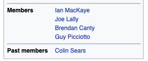
To get the members I looked for the Members and Past Members containers and pulled out all of the links to member pages:

From those linked member pages I could pull links for all the other bands they’d been in from the Associated Acts section.
I didn’t just jump straight to the Associated Acts section in the band page because I wanted to structure the data in a way that would let me check how I’d got from one band to another, which meant going through the member pages. The exception was where I pulled up a solo artist (e.g. David Bowie) who would have associated acts but no members section. In those cases I recorded the artist as the band, and then as the sole member of the band, and then recorded their associated acts.
What The Data Looked Like
So I wrote a function that took a band name, checked for the proper title of the web page, pulled the links to the member sites, then for each member pulled their associated acts (skipping over the main band), then ran through each of these associated acts and pulled their members (skipping over members in the main band), then ran through all of these members and pulled their associated bands.
I ended up with nested dictionaries that looked like this:
{
main_band:{member_1:[associated_band_1, associated_band_2],
           member_2:[associated_band_3, associated_band_1]},
associated_band_1:{sub_member_1:[sub_band_1, sub_band_2],
                   sub_member_2:[sub_band_3]},
associated_band_2:{...}
...
}
For anyone not familiar with python dictionaries (which are denoted by curly brackets), it consists of a number of keys, and then values associated with that key, e.g. {key1:value1, key2:value2}. In the example above, the value associated with the key main_band is another dictionary with keys member_1 and member_2. The value associated with member_1 is a list of associated bands (lists are denoted by square brackets).
Building A Network
Networks are described by abstract objects that we refer to specifically as graphs.
Graphs are made up of:
- Nodes: these are points where connections meet, which in this case will be the bands.
- Edges: these are the connections between the nodes, which in this case will be the band members that join two bands.
Given the dictionaries above, I figured that the nodes are:
- The main dictionary keys (bands linked to main band members, e.g.
main_band,associated_band_1). - The values of sub dictionaries apart from main band (bands linked to members of linked bands, e.g.
sub_band_1).
And the edges are:
- Keys of all sub dictionaries (members of main band and members of linked bands, e.g.
member_1,sub_member_1). I was careful not to count shared band members as edges when those band members were both in a band higher up the tree; if a member of the main band A was in associated bands B and C then I didn’t want to create a direct link between B and C unless they shared members that weren’t in band A, otherwise the graph would be overwhelmed with direct links that don’t really tell us much.
The values of sub-dictionary for the main band aren’t needed as they’re replicated as keys in the main dictionary (associated_band_1 etc).
I then realised there while this would create the correct hierarchical trees, there would be links between bands at the ends of the trees (i.e. the sub_band nodes) had links between them. To grab these I had to build a new dictionary where these sub_bands were the keys and their members were the values (which required more web scraping), then loop through this dictionary comparing each member to all other members to find links. This became quite a hungry process but without it we’d be losing a whole lot of interesting connections.
I used the python library networkx to build the graphs, which was as simple as passing in the lists of nodes and edges that I’d collated from the band dictionaries.
Plotting The Graphs
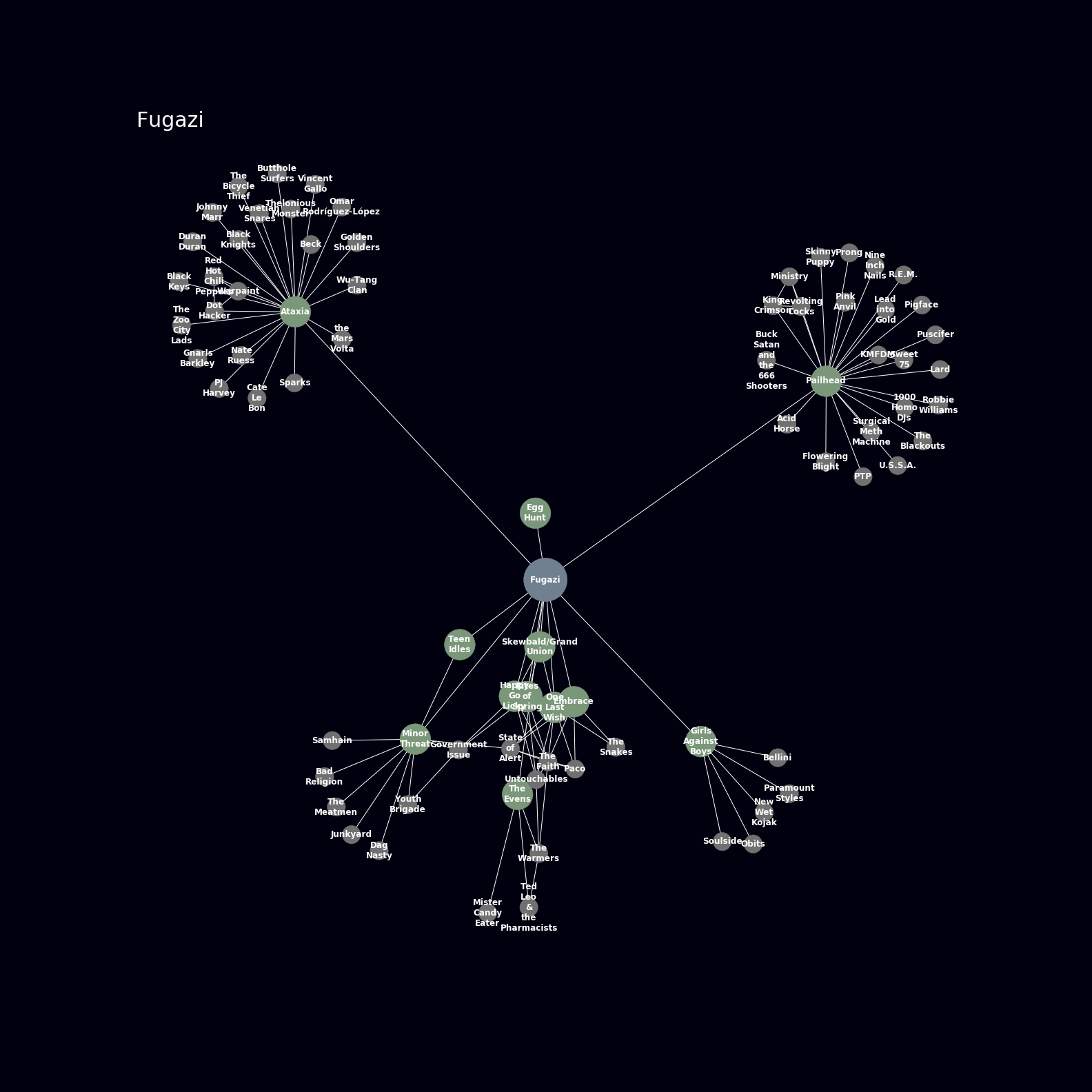
Networkx has a really straightforward function called .draw which gives you a plot of the graph. When you combine it with the matplotlib.pyplot functions you can customise it to look really pretty, which in this case meant:
- Setting the background to black (obviously if it’s about bands it has to look dark and cool).
- Setting colours for the main band (blue), immediately connected bands (green), and end bands (grey).
- Setting sizes for the band nodes. I considered setting the sizes based on the number of connected edges or something like that, but in the end it seemed like we had enough going on visually so I just made the main band large, the immediate bands medium, and the end bands small.
- Printing the band names over the node markers.
- Setting the plot area based on the number of nodes. I played around and found that a square plot with side length of 2.5 times the square root of the number of bands gave a reasonable spread. It was a balance between making plots that weren’t huge but giving enough room so the band names are readable. It still ended up with some regions where it’s just a mess of text and lines and circles, but nothing’s perfect.
So, this is what we ended up with (click to enlarge):
Pretty sweet.
Making Loads Of Plots And Building An Attractive Gallery
For a quick list of bands to build graphs for I turned to the NME’s 100 most influential artists. It had a few shocking omissions (no Pixies? no Talking Heads?) which I added in manually, along with a few of my own favourites (Shellac, Themselves, etc).
I banged my head against a load of CSS to make this nice gallery. I won’t go into the details too much, but if you have a look at the repo for this blog you’ll see that it just involved looping through the images folder to create thumbnail links with overlaid text. The nice thing is that all I have to do to add more images is save them into the folder and the page will automatically alphabetise them and create links. Yeah, I could have them opening in a lightbox rather than a window, but I’m not a web dev.
Where It Didn’t Work
The title of this report is a nod to The Fall, but they are conspicuously absent from the plots. This is because on their Wikipedia page all of the members apart from Mark E. Smith are listed in a separate members section which I honestly couldn’t face parsing. I could update the scraping function to link straight into the Associated Acts section on the band page but that’s an update for a later date.
I was also unable to include smaller bands like Drug Church (my go-to for when I need something loud and shouty, which is often) because the members don’t have their own pages, and once you go to the band’s one linked Associated Act there are no further linked acts, just unlinked band names.
One Further Bit Of Analysis
While building these plots I pulled out a bit of information about the graphs:
- Number of nodes.
- Number of edges.
- Betweenness centrality of the nodes.
One common thing you want to look at with graphs is the shortest route between any two nodes. The betweenness centrality is a measure of how many of these shortest paths run through each node or edge. By plotting the betweenness centrality of the nodes we can get a feel for which bands sit at the centre of each network. Usually this turns out the be the main band that we’re investigating because we built the network around them, but not always. I created a gallery of these plots here, and while they’re not quite as pretty as the graph plots they’re a bit more sciencey.
What I Learned And Where I Could Take This
This has been a test of my web scraping skills, and to be honest I was almost lost until I found the .parent function to return the container of an element that you’ve found in BeautifulSoup. I’ve also really stretched the part of my brain that conceptualises data structures; plotting out how I needed to store the data in the dictionaries saw me having two-way conversations out loud with myself, and it was lucky I had the flat to myself at the time.
Finally, I spent a lot of time pinching bits of CSS from all over the place to make nicely tiled galleries, which turned out to be one of the most pleasing aspects of the project. As much as UI can seem like the woolly end of a project when you’ve got your head in the data, you can’t beat the feeling of making something that not only works but looks good too.
I considered building a web app so people could generate their own graph plots, but some of the bigger graphs can take a few minutes to build so this didn’t seem sensible. Plus if it’s just me running the scraping then the impact on Wikipedia is negligible, but if I let other people on it then I guess it runs the risk of accidentally DDoSing the site.
That’s The End
Thanks for reading, even with harsh editing this report turned into a bit of a sprawl. As always if you have any queries or feedback please feel free to contact me.
